Website & digital strategy for a leading multi-branch estate agent

Farrell Heyworth is a leading multi-branch estate agent across the North West.
In the face of changing consumer behaviour and online competition, we implemented a new digital strategy – moving from a traditional high-street agent with a website, to a digital-first agent with branches.
The previous website faced several challenges with confusing navigation weighted towards buyers, and integrations into legacy systems that provided a slow and sluggish journey.
The aim was to increase conversions through an improved user experience, introduce familiar search functionality from popular property portals, and promote all areas of the business equally – sales, lettings, mortgages, and conveyancing.
Industry
- Property
Location
North West, UKDeliverables
- Brand Refinement
- Digital Strategy
- UX & Customer Journey Design
- Website Design
- Website Development

Approach
We undertook detailed research through surveys and heatmapping, understanding user intentions and behaviour to design a website that worked for the Farrell Heyworth customer.
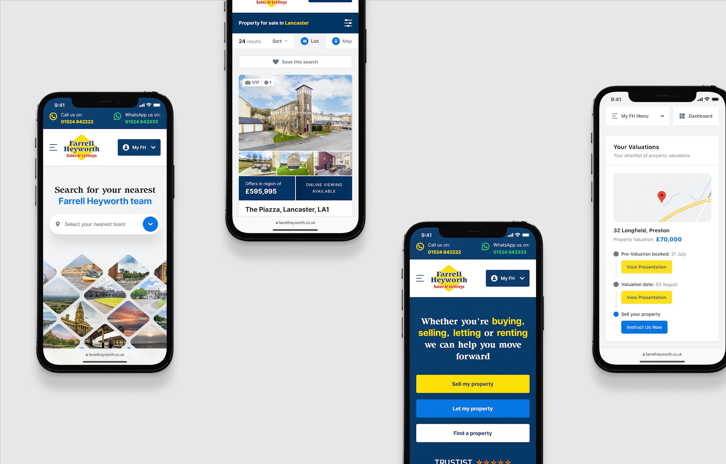
Using the data, we opted for an intention-based design, unusually introducing friction into the website to present visitors with three options on the homepage: to sell, let, or find a property – encouraging buyers, sellers, and landlords alike.
Considering user feedback and frustrations with the webchat, we opted for a more familiar platform, integrating WhatsApp to improve the user experience and communications at an operational level across all teams and branches. This allows the user to keep a constant thread of chats with Farrell Heyworth, and for agents to view all communication centrally, making the user journey easier to track and smoother for the customers.

Brand Refinement & Creative Direction
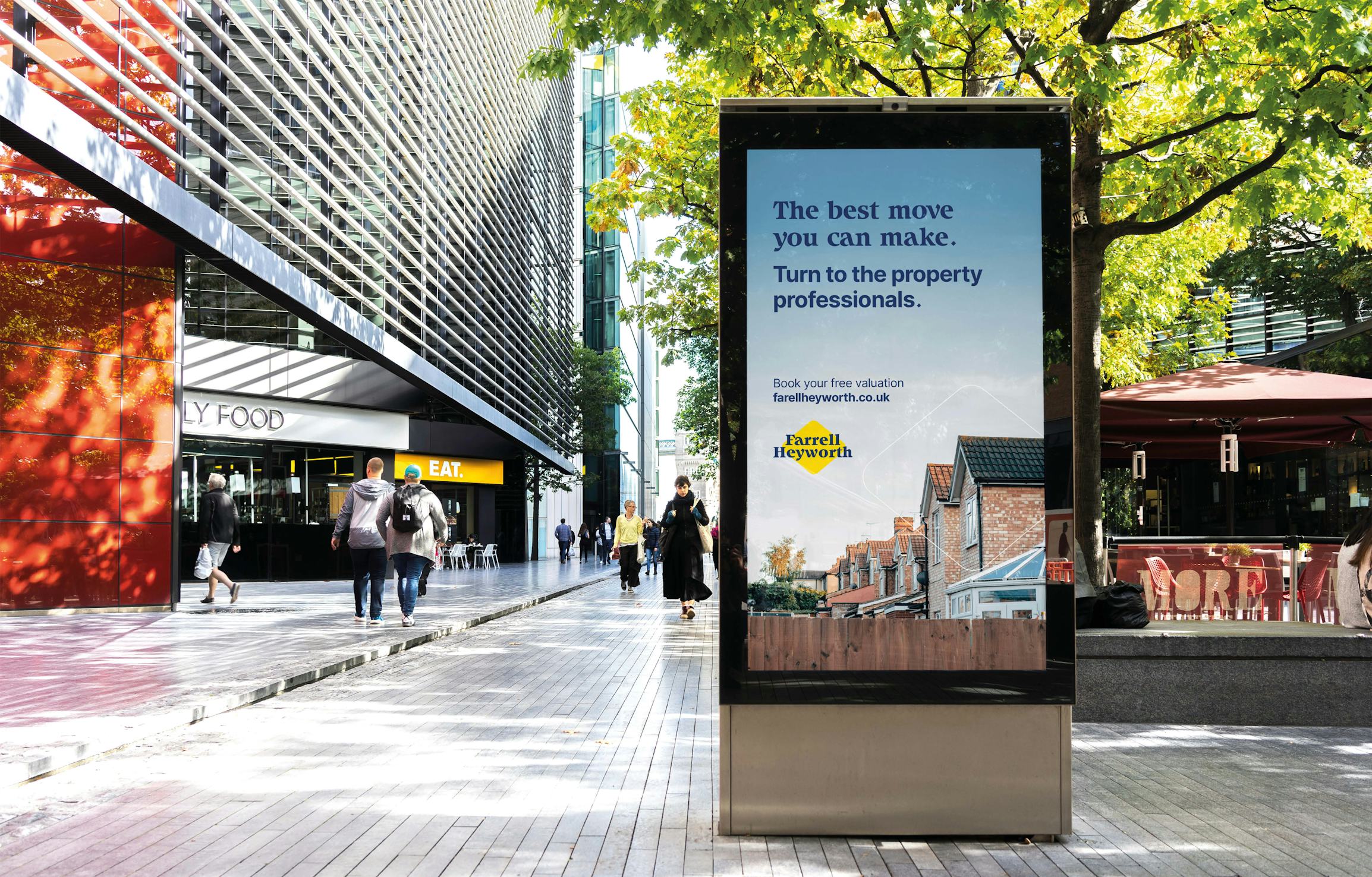
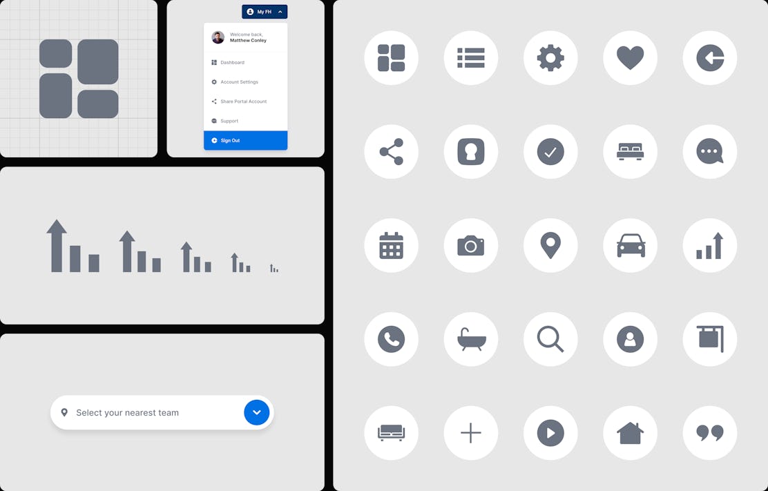
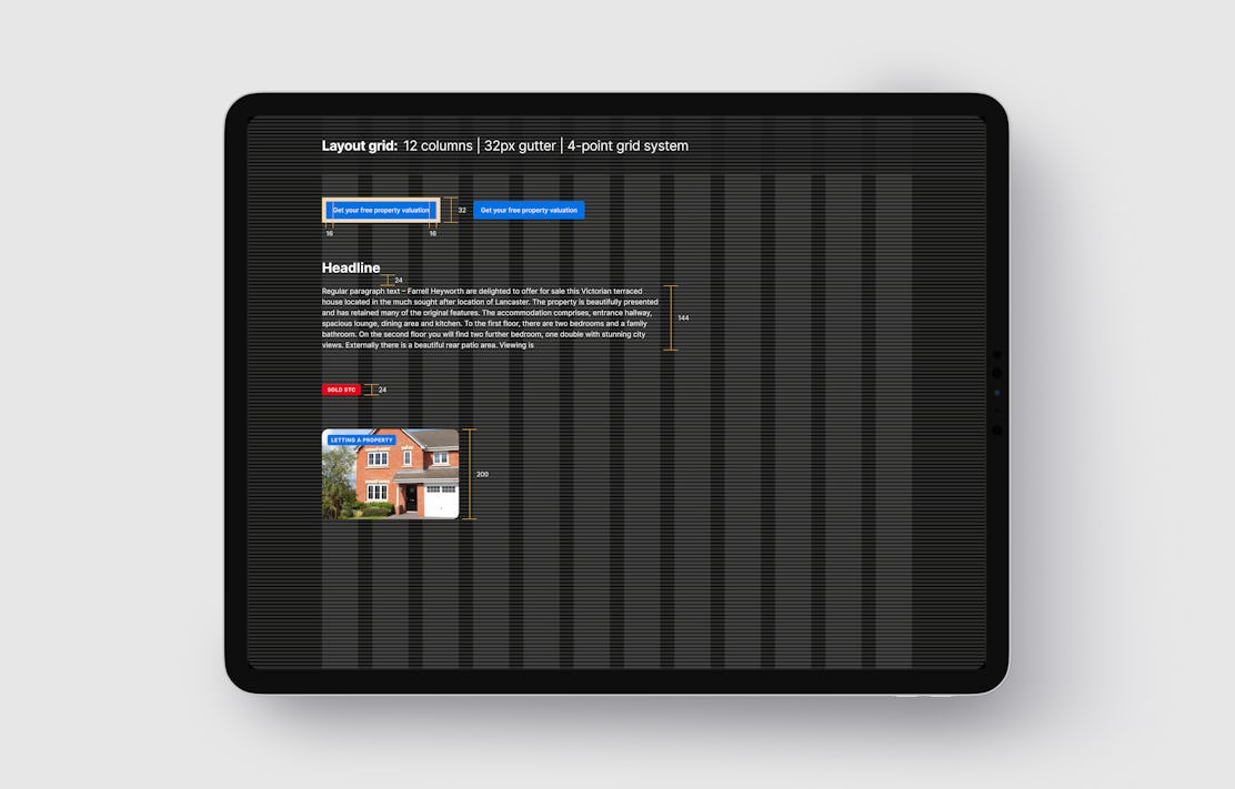
As part of the project, we refreshed the Farrell Heyworth brand, keeping the core identity with sharper assets to develop a recognisable design system. Yellow and blue remain at the heart of the brand, with an emphasis on the Farrell Heyworth diamond to highlight subjects and people in images, and a wider use of their typeface across all output.
Campaign headlines are data-driven to promote Farrell Heyworth’s success as a leading estate agent in the region.


Outcomes
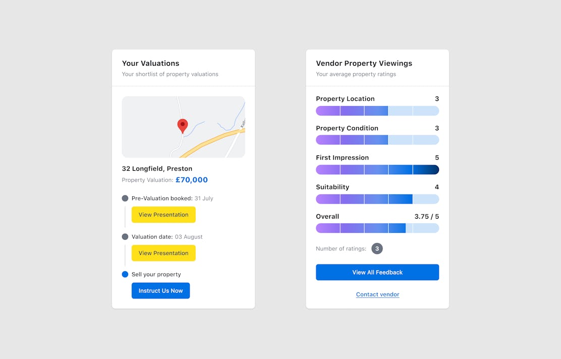
The website is a bespoke design and development on Umbraco, with functionality that includes an extensive property search that integrates into custom software, mortgage affordability calculators, and a branch locator with dynamic telephone numbers across the site.
Results from the relaunched website demonstrate an increased user satisfaction score from 5.23/9 to 8/9. Year-on-year enquiries show a 22.85% increase in May and 32.39% increase in December.



Project Info
EXP Team
Darren Dedrie
Tom Grattan
Emma Kidd
Rob Kirby
Daniel Wallace
Services
Brand Refinement
Digital Strategy
UX & Customer Journey Design
Website Design
Website Development
Technology
CMS
Umbraco 8.0
CRM
Bespoke system/integration
Languages
C# & .NET
JavaScript
React.js & Node.js
3D Library
Three.js / R3F
API Integrations
Google Geocoding
Rightmove
WhatsApp
More work
Got a project in mind? Let’s talk.
Got a brand or digital project in mind? We’d love to chat about how we can help you.
Tom Grattan


